Media Evaluation by laurennoakesox
Monday, 28 April 2014
Saturday, 5 April 2014
Friday, 28 March 2014
Progression in our group
Through out the progress within our group i feel like i have gained a better understanding on how to work better within my group as a media student, as coming into media with no previous knowledge i feel like i was able to learn with in my group. However at first it was quite difficult, our group as a whole had no real idea of what or how we were going to approach things. Since this point our group pulled our selves together and made dramatic changes to make ourselves progress as a group and individually. As an individual i do feel like i have been able to work on my team management skills and team work skills which play a big part of making a team able to progress.
At the beginning when doing the blog i didn't take it as seriously as i should of neither did the group, we soon realized how important this was when one group member took charge and helped us move on quickly and blogging more. When doing our Continuity task i felt like i was very much in charge of this, i was doing the filming and organized the people to film. However i soon realized that trying to do everything was very difficult and put pressure on me. This was when two group members helped me a lot with the filming. And we found that Jordan was very good at filming and was able to collect very good steady shots. I found that within in the group i was the one who was good at organizing things.
When it came to editing I didn't know anything at the beginning. But working as a group Jordan helped me learn how to do basic editing on the Adobe (Premier Pro & After Effects) program. This helped me feel more confident within my group as i now had basic camera skills and editing skills. When we moved onto our opening film task i felt like one member in particular took role of the leader and helped our group progress massively.
When choosing location for our film i straight away said my house would be good for shooting a thriller horror film. Now looking back i think this put a lot of pressure on me, realistically it would of been a lot easier for our group if we chose Jordan house as he lives very close to our school, this would of made it more convenient for our whole group. As it was my house i would have to keep checking with my parents if it was okay to have the house free a lot and having a baby in the house proved to be quite difficult as every time we filmed we would have to move all her toys etc. Although the fact that we had baby equipment helped with out story as it was about a baby sitter. Further more i found that the Actor i chose often couldn't make shooting sessions which held our group back, as she was one of my friends i felt that if she didn't come it put pressure on me as our group couldn't progress with the film any further. If we thought better at the beginning we should of used a girl within our own group making it better and easier for us to film whenever.
Overall i feel like the decisions that we made at the beginning did effect our progress however we managed to pull through it and our end product is very much to our standards of how we imagined our opening to look. Even though i wasn't the leader of the group i still do feel like i am able to take better charge of a group and i have shown i can learn new skills as well as develop old skills.
Opening Background Music
For the our music within out piece we decided we wanted background music that continued throughout the whole opening. We wanted the music to help heighten the tension and ominous feel within our clip. So when strange things are happening in the house the music changes to a deeper scarier sounding music which will then relate to our genre of a horror-thriller film. Our group member looked for the music, we found the clip on a copy-right free website this means that we are allowed to use it legally. The piece lasts just over 3 minutes therefor this gives us enough time for editing to help match the music to our piece at the right points. The piece of music that we have agreed and chosen on has an ambiguos, sinister tone and is perfect to have in the background quietly due to the monotone level and the synths to portray our horror-thriller genre.
Monday, 17 March 2014
The House Final Intro
This is our final intro, our whole group was happy with this opening title and it fits with the atmosphere of our opening. The text zooms down with a blur and stays on screen for a few seconds for the audience to establish the title and create tension before it quickly zooms out towards the audience with our first establishing scene. This title is perfect for our films and helps set a tense nervy tone to the start of our film.
The House 2nd Intro
This was our second idea, this match the criteria of how we imagined our opening title to look like. We took away the wiggle and included a 'blur' effect to the text. This blur carried on as if the text was jumping forward before it quickly fades out into the background. However with this intro i felt that it didn't flow very well with the text coming back out, i also thought that we should have the scene fading in through the 'O'.
The House 1st Intro
At first we thought of the idea of the title zooming out with the 'wiggle' effect. We thought this effect would distort the audience, however we thought that this title as a whole looked fake and changed the tone of the film. Our film is quite flowing and ominous. This title represents a quick jumpy opening. As we do want a moving title we will have to further improve this and look more into titles.
Productions Intro
We decided that we needed a production company logo animatic to be at the start of our film. When researching we found that the production company was always present first so we felt that this was important for our short opening.
Wednesday, 12 March 2014
Sound in Horror films
Se7en
Within this opening the director has used parallel sound to create a tense nervy atmosphere for the audience as it shows sharp knife blades scratching away at skin which is represented by the sound of an eery chalk board scratching sound. For our thriller horror i think that if we could use parallel sound to rein-act the action of what happens with in it would create the nervy feel for the audience, which is what we are trying to do. Further more it uses thunderous sounds, which connotes danger and darkness. In our thriller horror opening, we could use sounds like this to show something bad is going to happen.
The first sounds i hear in the clip are deep drowning sounds like a trumpet. This again creates a dark tense atmosphere. The director has also used non-diegetic sound which sounds computerized which helps to add a scary atmosphere. In our opening i think by adding in sound effects it will help build up the tensions the the audience when watching, such a dramatic noises which you wouldn't expect.
Within this opening the director has used parallel sound to create a tense nervy atmosphere for the audience as it shows sharp knife blades scratching away at skin which is represented by the sound of an eery chalk board scratching sound. For our thriller horror i think that if we could use parallel sound to rein-act the action of what happens with in it would create the nervy feel for the audience, which is what we are trying to do. Further more it uses thunderous sounds, which connotes danger and darkness. In our thriller horror opening, we could use sounds like this to show something bad is going to happen.
The conjuring
The first sounds i hear in the clip are deep drowning sounds like a trumpet. This again creates a dark tense atmosphere. The director has also used non-diegetic sound which sounds computerized which helps to add a scary atmosphere. In our opening i think by adding in sound effects it will help build up the tensions the the audience when watching, such a dramatic noises which you wouldn't expect.
Our Title
We got together and discussed the ten fonts I previously posted of the possible title typographys that we might use for our title. We then settled on the following font: Optimus Princeps. The image below is an example of what our title would look like with this font:
We felt this was the ideal typography four our film opening due to it being a very traditional looking font and not sticking biasedly to one side of the genres. For example if we had a bold, sans serif capitlised font like the following of an action genre:
We wouldn't use the text above because it is a typical font of a action thriller with bold, sans serif and capitalised text. However the smoke kind of rubbed out affect on the text looks good and make it seem distorted and more of a horror. This is something we could use in our own text over the top it to give it the same effect.
Furthermore this is a science-fiction/psychological thriller that uses the same bold, sans serif, capitalised text as the skyfall text above. Furthermore the colour red would represent danger and make it stand out more because it is an eye catching colour. This is not what we want to go for as a look as we want a more mysterious, classic and old fashioned serif font.
The reason why we wanted to choose a font such as 'Optimus Princeps' was because we had looked at previous fonts in horrors and thriller-horrors that had this similar style of old fashioned, classic styled text.
For example these are some similar horror typography fonts:
Then here are some examples of some more specific horror thriller typography fonts that are very similar to ours which we have based it on:
This is why we wanted this classic, serif, old fashioned style similar to times new roman because it is very reoccurring in horrors and thriller horrors.
Evaluation
I think looking at horror and thriller film titles helped us decide on our final title. We feel that most of the titles of these films had a very classic, serif style font, this is then heightened with a dramatic and eye catching background. I like the text for our title because i feel that it is quite plain but effect because it doesn't give to much away in a sense of being a horror movie. The writing also symbolises a typical house number and seeing as the the title is 'THE HOUSE' it fitted with our theme.
Monday, 10 March 2014
Actress
For our actress we have chosen Emma Thomas, we feel that she would be right for the part as she looks like stero-typical protagonist within a horror-thriller film; young, slim female with long hair. In most horror and thriller films they use young naive teenagers or young adults, by using Emma Thomas i feel it will bring a more tense and nervy feel to our opening. I feel by having Emma it stereo typically fits the idea of a baby sitter as she is a student trying to earn some money, within our opening she will be wear a white jumper and her hair down representing her innocence as in most horror movies. I also think by using a teenager within our opening will help us meet out target audience, as more teenagers are likely to watch a film with their age group in as they can relate to it.
Costume
When looking at costume we wanted a costume that was very typical of a modern teenager as well as something you could maybe expect within a horror-thriller film. Therefore we wanted our protagonist to be wearing something basic and plain. For example leggings, jeans, jumpers, t shirts etc. Furthermore we also wanted casual plain colours. For example we decided we wanted some kind of white upper garment - like a white jumper or top.
The white jumper below is like the jumper our protagonist wears throughout the opening. We chose this as jumper can seem 'home'ly' as well as it being a casual piece of wear that is communal worn by teenage girls and women of all ages in modern society. Furthermore we decided we wanted it to be a white jumper as this would represent purity and innocence because of the social connotations and general associations with the colour white. We thought the white would represent innocence and angelic like almost like an angel or a dove.
The white jumper below is like the jumper our protagonist wears throughout the opening. We chose this as jumper can seem 'home'ly' as well as it being a casual piece of wear that is communal worn by teenage girls and women of all ages in modern society. Furthermore we decided we wanted it to be a white jumper as this would represent purity and innocence because of the social connotations and general associations with the colour white. We thought the white would represent innocence and angelic like almost like an angel or a dove.
Furthermore these are the type and style of jeans that our protagonist will be wearing throughout also. We thought this was fitting as she is meant to be represented as just typical female teenager of a modern society and jeans are the most ideal, casual and normal trousers for them to wear. Therefore we also thought this was better than leggings and any pyjamas as pyjamas would show its her house whereas we want to show she is a babysitter and this isn't her own house therefore wearing clothes to go out but as if it is her own household as she is used to babysitting there. Furthermore leggings are associated with more lower class and are too casual. Moreover typical leggings are black and in some low key lighting it is then harder to see her legs and what she is doing. Therefore making us decide that navy blue jeans are the most ideal.
These white jumper and navy blue jeans are what we decided on.
Evaluation
When looking at the clothing for our opening we wanted to go for a casual look. We found that the white jumper with the blue jeans looks casual and also looks young and stylish. This works for our opening as our character is a teenage baby sitter. By having a simple causal costume it doesn't effect the realism with the piece either. This is a big part of our film as it is set in an ordinary middle class home. Having a white jumper helps portray our character as innocent and shows she is venerable. We chose the jeans because we feel that most teenagers in toady's society would were jeans as it is seen as 'the norm'. I felt that having these clothes would be more suitable than having pyjamas or jogging bottoms this is because she is a baby sitter in somebody else's home therefor she wouldn't be in those type of clothes.
Post-Production Realisations
As a group we took the shots from the previous shoots and imported them all onto premier pro where we will edit them. We started going through them decided on which ones we could use and which ones we couldn't. By doing this it narrowed down the shots massively, and already realised that we would have to reshoot lots of scenes. After we sorted through them we took the shots that we thought were good enough and put them into our premier pro timeline. By doing this we could place them inorder as well as edit them to fit with each other consecutively on after another. When we done this we then began to realise that some of these shots had very small jolts and were not acceptable to be in our opening, we also found that not all the shots flowed together meaning we would need to think of new shots to put in between the ones we had.
Therefore we know we have to shoot more shots and maybe shoot a variety of other things that could be used as fillers to also create mysteriousness withing the opening as it is a horror/thriller which tend just to imply themes rather than actual show and consequently fit into our genre as well as making the opening more natural and flow better overall.
Therefore we know we have to shoot more shots and maybe shoot a variety of other things that could be used as fillers to also create mysteriousness withing the opening as it is a horror/thriller which tend just to imply themes rather than actual show and consequently fit into our genre as well as making the opening more natural and flow better overall.
second shoot
I believe our second shoot was a lot more successful compared to the first shoot, i feel as a group we are now able to come together and be more serious about doing the work. As a group we came together before the shoot a discussed what needed to be done in order to get something good out of our shooting sessions. Within this shoot we managed to get a lot more that was needed done in order to progress well and get ahead. Because of this we was able to put shots into our Premiere Pro timeline, watch them and evaluate them and decided what needed to be done next. From this shoot we was able to get a lot of good shots which we are able to use. furthermore we also noticed small things when filming such as the position of props, the Mis-en-scene etc that we did not notice before that needed to be removed or positioned differently.
Even though we got some good shoots within this shoot i feel like we still didn't have enough concentration within our group, which did slow us down so as a group we talked and decided we need to be more focused and determined if we want to get more filming done in order to reach our deadlines. However now we do have a good opening that we do not need to re-shoot, and i feel we have became more experience as a group on our filming and editing skills allowing us to create a better opening.
Even though we got some good shoots within this shoot i feel like we still didn't have enough concentration within our group, which did slow us down so as a group we talked and decided we need to be more focused and determined if we want to get more filming done in order to reach our deadlines. However now we do have a good opening that we do not need to re-shoot, and i feel we have became more experience as a group on our filming and editing skills allowing us to create a better opening.
Sunday, 9 March 2014
first shoot
First Shoot Evaluation
From our first shoot we realized a lot of problems with our shots and this was a big awakening for us. For example we had no shots that were usable for our actual final opening sequence and it was seen as a waste of time. However this was actually a good learning curve for us as we realized a lot of faults and things we need to change/do better next time.
For example we had terrible lighting and didn't realize this. It was extremely low key lighting and we couldn't see much of the scenery or what was actually happening.
Furthermore the lighting being like this made all of our scenes worthless and not usable which was a shame, because if it wasn't for this then we would of been able to maybe use some of the shots.
We also realized that we had to make sure everything was set with our location. For example on our first shoot day Lauren's house was very busy and therefore other things were happening in the house which the microphone on the camera picked up. Consequently we now know that we need a completely free house for our shooting days to be successful.
We also tried to experiment with POV shots, however this was harder than we thought it would be and cause us to have a lot of un-still and off balanced shots. Furthermore a few of our other shots were off balance due to a bad tripod. Therefore we now know that we need to make sure all our equipment is okay before as well as practicing POV shots more.
As well as this a lot of our group kept laughing and not staying focused and this was hard as the film we need it to be completely silent and everything to happen perfectly otherwise it can ruin the entire piece. We now know that we can't laugh and make noise on camera because sometimes we might not be able to edit it out.
Evaluation
From our first shoot i feel that now we can progress, obviously as a new group of people being put together we weren't as focused as we should of been. As none of us has had any proper training with camera and tripods we found that none of our shots were good enough to be put into our two minute opening. Because of this we will have to re film, we also faced other problems such as lighting. When we was shooting it was light outside so we tried covering up the windows with sheets, this then made it two dark to film. Now we have done one session we are all more focused and determined to get our opening done, we know how we can improve from this and make our work better.
Friday, 7 March 2014
Openings Mis-en-scene
Mama
Character(s): little girl about 4 years old, man in his 30's, baby
Costumes: black hat, coat. Black suit, white shirt and black tie.
Setting: large house down a private road with trees at the front and back. Car parked out the front with the drivers door open. Large childs bedroom with various toys and things to play with. Pink wallpaper with birds on. Dining room down stairs with crystal chandelier hanging above the table. Snowy woods with a small shack deep within it.
Props: teddy bear, cot, blanket
Psycho
Characters: young man. Young woman. Two business men. Female secretary.
Costumes: long skirt, shirt, trousers, suit, tie, hat
Setting: big city. Cheap hotel. Office with indiviual desks
Props: thick pile of money, paperwork
Exorcist
Characters: priest, 40+ year old man
Costumes: black trousers with a long black coat. White shirt, silver watch, red tie
Setting: rowing in a big lake with trees all around. Small town. Office in a house, many pictures of the same woman. Night time in small town, lots of fog, few street lamps on. Empty church, crosses, flowers, candles.
Angels and Demons
Characters: priest, 4 men, hundreds of people, catholic leaders, pope, news reporters, nuns, vicars
Costumes: black priest outfit. Red priest outfits. Pope costume with a yellow hat
Setting: open area in Rome outside the popes church which has been set out into paths so they can carry the coffin down a certain way. Inside the church where there is a large cross with jesus on it, candles, red drapes, benches.
Props: coffin, hammer, crosses, cameras, golden cup on a chain, silver chalices
To summarise my findings, I can see that all of these films are set in upperclass areas with large houses and the characters
Evaluation
From my group members work i understand that within horror thriller films that they are usually set within a working upper class house, which makes me think we have chosen the right location for our thriller horror opening. It also helps us within our research as it shows us typical props used and certain characters used for different themes as well as clothes they wear.
Wednesday, 5 March 2014
Our film name + typography
Horror/Thriller Decided Name - 'The House'
We finally agreed on a decided name to go along with our title sequence. We all agreed that the name 'The House' was the most fitting due to the fact it is based all around the house and throughout the title sequence it is implied there is a supernatural or paranormal presence within the house also. Furthermore all the shots of are within the house and are filmed in a ambiguous and mysterious way to present it as something that builds tension with the way it is filmed and the specific items within the house. For example the mirror, fire and control/tv. Moreover we also thought that to end the title sequence we would have the title right at the end. Therefore we thought that the ending scene could get smaller and then go through a letter 'O' in the title 'THE HOUSE' centered in the middle of the screen.
Typography
(Group members work)
Typography For Our Title

Ringbearer

We finally agreed on a decided name to go along with our title sequence. We all agreed that the name 'The House' was the most fitting due to the fact it is based all around the house and throughout the title sequence it is implied there is a supernatural or paranormal presence within the house also. Furthermore all the shots of are within the house and are filmed in a ambiguous and mysterious way to present it as something that builds tension with the way it is filmed and the specific items within the house. For example the mirror, fire and control/tv. Moreover we also thought that to end the title sequence we would have the title right at the end. Therefore we thought that the ending scene could get smaller and then go through a letter 'O' in the title 'THE HOUSE' centered in the middle of the screen.
Typography
(Group members work)
Typography For Our Title

Ringbearer

I Still Know

After looking at other typography in thrillers and horrors we came to the conclusion that we wanted a font with either fine, capitalised, structured serif font or bold and capitalised sans serif font. For example we either wanted a bold sans serif title with white text against plain black background with lots of negative space. Or we wanted to have a more elegant fine serif title that almost resembled the looks of a house name or door number on a house - as the title of the film is 'The House'. Therefore we want to show the references and links between the typography and what we are trying to portray. However some of the problems with some of the fonts above is some of them can tend to be too horrific and lose the thriller side of it. As the task we were originally given was a thriller genre opening to a film and not a horror genre. Therefore we are trying to get a nice mysterious title that has connotations to the two but isn't too much like a horror or a thriller.
My Conclusion

Traveling Typewriter


Major Label


Portmanteau Regular


Cold Coffee
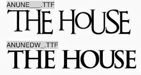

An Unfortunate Event


Bebas Neue
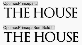

Optimus Princeps
After looking at other typography in thrillers and horrors we came to the conclusion that we wanted a font with either fine, capitalised, structured serif font or bold and capitalised sans serif font. For example we either wanted a bold sans serif title with white text against plain black background with lots of negative space. Or we wanted to have a more elegant fine serif title that almost resembled the looks of a house name or door number on a house - as the title of the film is 'The House'. Therefore we want to show the references and links between the typography and what we are trying to portray. However some of the problems with some of the fonts above is some of them can tend to be too horrific and lose the thriller side of it. As the task we were originally given was a thriller genre opening to a film and not a horror genre. Therefore we are trying to get a nice mysterious title that has connotations to the two but isn't too much like a horror or a thriller.
My Conclusion
After looking at these fonts we came to a decision of using Optimus Princeps font. I believe this font portrays a dark sinister feel but still is plain enough to keep an ominous feel. We have chosen this font as we have set the opening within a house, the elegant fine seif title helps resembles the look of the door name or door number of a house. When looking at a title i thought having white writing on a black background could help connote innocence within the girl through the writing and evil around her with the black background.
Props
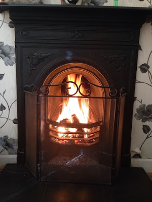
When we met up to do our first shoot we took some photographs of the specifics in the scenery and props that we will be using. This included the likes of the fireplace, mirror, baby monitor, tv control and sink tap. These were some of the specifics that we were going to focus on during the opening to present tension and make the audience focus on to draw their attention. As when we looked at other openings we notices there were always stereotypical specifics like the ones we have chosen that are emphasised in the opening to create a ambiguous and mysterious start to the film or to create confusion with the audience. These can be seen as symbols within the opening or film that are used to present something.For example the dripping of the tap could be shown to show the silence and how noticeable to dripping sound is because of how silent it is, therefore presenting tension to the audience. Furthermore the fireplace, the monitor, tv control and the mirror all have this same effect. We wanted to present some of these specific symbols within our opening to create tension in a stereotypical way as the audience would notice this and see it as a sign of danger - like a sign.

Reflection testing
Reflection testing
(Group members work)
On our first shooting day before we set off with recording Matt and I decided to do some reflection testing in the mirror above the fireplace which we could incorporate as some type of shot in the storyboard of our opening. We thought that we could capture the protagonist exiting or entering the room from one of the following angles. Therefore by doing this we can also show someone else in the mirror or in the background behind her which she cannot see. As after researching into mirrors in horror films we know that they sometimes present paranormal, souls and ghosts to be trapped in mirrors or a mirrors a gateway to seeing these spirits. For example the following picture:
setting
For our setting we wanted a house that is slightly upper classed but still a working class home, by having a house like this i feel that we can target our audience, and for the people watching making it relate-able by having our house as a stereotypical upper/working class house with parents and a baby living in it. I believe that my house was perfect for our story line that we had chosen. My house is clean and tidy and has the perfect equipment and layout for the kind of camera angles and shots we wanted. I also had all the baby equipment we needed such as the baby monitor which is going to play a big role in creating the tension to the piece, i also have a statement fireplace with a grand mirror above it which also helps show our typical family upper class warm home. With this stereotypical slightly upper class house establishing that this is a family home it should be safe and secure as stereo typically the rich white families in films and especially horror films are more safe than ethnic ones. The setting also helps contradict the idea of a nice safe home as it is situated within black park which automatically brings the stereotypical view of a thriller horror film as it is dark and spooky. I feel if we filmed in my house it would bring the right atmosphere and feel to what we are looking for, it gives the right message and stereo typically fits what we want.
Story board + Shot list
Shot list
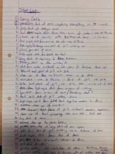
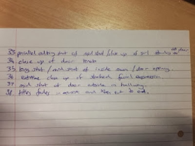
This is our shot list for our film, by having a shot list it helps us have our initial ideas when we start filming once we have done the basics of our shoot list we were then able to explore and expand by trying different angles for the same shot. Our story board also helps us as we know what we want our opening to look like with this again we can then expand on it when we actually come to filming it.
Story Board
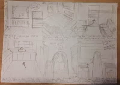
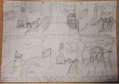
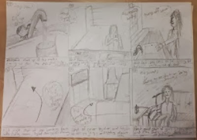
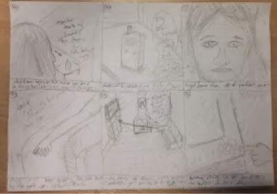
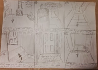
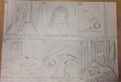
This is our shot list for our film, by having a shot list it helps us have our initial ideas when we start filming once we have done the basics of our shoot list we were then able to explore and expand by trying different angles for the same shot. Our story board also helps us as we know what we want our opening to look like with this again we can then expand on it when we actually come to filming it.


Story Board


Subscribe to:
Comments (Atom)


