We finally agreed on a decided name to go along with our title sequence. We all agreed that the name 'The House' was the most fitting due to the fact it is based all around the house and throughout the title sequence it is implied there is a supernatural or paranormal presence within the house also. Furthermore all the shots of are within the house and are filmed in a ambiguous and mysterious way to present it as something that builds tension with the way it is filmed and the specific items within the house. For example the mirror, fire and control/tv. Moreover we also thought that to end the title sequence we would have the title right at the end. Therefore we thought that the ending scene could get smaller and then go through a letter 'O' in the title 'THE HOUSE' centered in the middle of the screen.
Typography
(Group members work)
Typography For Our Title
Ringbearer
I Still Know
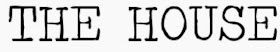

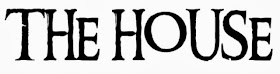
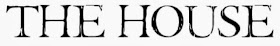
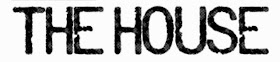
After looking at other typography in thrillers and horrors we came to the conclusion that we wanted a font with either fine, capitalised, structured serif font or bold and capitalised sans serif font. For example we either wanted a bold sans serif title with white text against plain black background with lots of negative space. Or we wanted to have a more elegant fine serif title that almost resembled the looks of a house name or door number on a house - as the title of the film is 'The House'. Therefore we want to show the references and links between the typography and what we are trying to portray. However some of the problems with some of the fonts above is some of them can tend to be too horrific and lose the thriller side of it. As the task we were originally given was a thriller genre opening to a film and not a horror genre. Therefore we are trying to get a nice mysterious title that has connotations to the two but isn't too much like a horror or a thriller.
My Conclusion
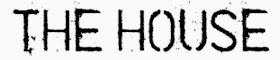
Traveling Typewriter
Major Label
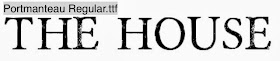
Portmanteau Regular
Cold Coffee
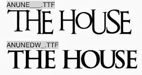
An Unfortunate Event
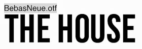
Bebas Neue
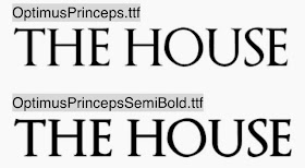

Optimus Princeps
After looking at other typography in thrillers and horrors we came to the conclusion that we wanted a font with either fine, capitalised, structured serif font or bold and capitalised sans serif font. For example we either wanted a bold sans serif title with white text against plain black background with lots of negative space. Or we wanted to have a more elegant fine serif title that almost resembled the looks of a house name or door number on a house - as the title of the film is 'The House'. Therefore we want to show the references and links between the typography and what we are trying to portray. However some of the problems with some of the fonts above is some of them can tend to be too horrific and lose the thriller side of it. As the task we were originally given was a thriller genre opening to a film and not a horror genre. Therefore we are trying to get a nice mysterious title that has connotations to the two but isn't too much like a horror or a thriller.
My Conclusion
After looking at these fonts we came to a decision of using Optimus Princeps font. I believe this font portrays a dark sinister feel but still is plain enough to keep an ominous feel. We have chosen this font as we have set the opening within a house, the elegant fine seif title helps resembles the look of the door name or door number of a house. When looking at a title i thought having white writing on a black background could help connote innocence within the girl through the writing and evil around her with the black background.
No comments:
Post a Comment